
Why Game Designers Are Borrowing from Digital Wallets and Web Apps?
By Alex╺
- PS4
- PS5
- XBox One
- Series X
- PC
Sit down with five game designers and you’ll probably get five different opinions on what makes an interface intuitive. Alongside classic menus and inventories, bold new UI patterns have slipped into popular titles and changed what players anticipate from their on-screen interactions.
Some, like checklists, radial inventories, or quick-swap HUDs, owe their look and feel to mobile apps and even fintech tools. But lately, features inspired by digital top-ups and lattice-style layouts are shifting how interface designers think about in-game economies and real-time updates.
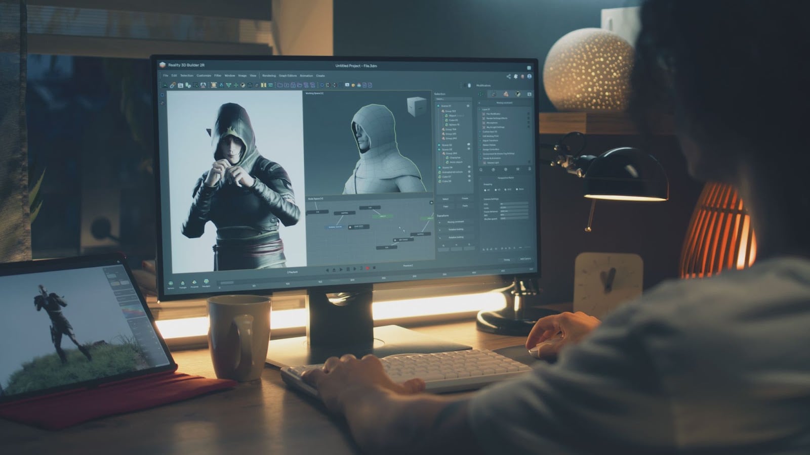
Designers face a tough riddle: how do you keep things visually fresh without adding friction or complexity? Studios constantly probe new ground, mixing snappy layouts with familiar visual shorthand from everyday tech. In the multiplayer scene, streamlined in-game stores and resource trackers often mimic real-world wallet loaders.
The rise of instant balance updates and quick-resupply flows has given birth to patterns now nicknamed “lattices”, inspired by grid-based digital wallets and payment systems.
A practical example is how Lattices top up mechanics allow players to replenish virtual credits across several platforms in just a few clicks, shifting the older menu-hopping approach towards a more modern, user-focused experience.
These patterns aren’t just window dressing. They offer a subtle feedback loop, where every action, reward, or purchase happens at speed and with complete clarity. By organizing options into responsive grids, players can review, select, and deploy items or upgrades with far less screen clutter.
This not only trims down cognitive load but also boosts motivation to explore additional features, sometimes without breaking the game’s pacing at all.
How Lattices and Top-Ups Raise the Bar for Personalization?
The best UI choices put power directly in the hands of players, letting them manage currencies, change builds, or collect rewards on their own terms. Lattice-inspired layouts are built for customization.
Instead of being tied to clunky step-by-step flows, players can see multiple upgrade paths, offers, or bonuses at once, and interact with what truly matters to them.
Developers designing for mobile, console, and cross-platform play know the routine: if your core systems aren’t straightforward, you risk losing attention fast.
When it comes to shopping for CD keys or game keys, both essential for unlocking digital games and add-ons, many gamers turn to reliable sources for safe and discounted access. CD keys function as unique codes that activate a product, bypassing shipping delays and offering instant delivery.
One marketplace that stands out in this space is Eneba, thanks to its vast selection, competitive prices, and clear information on region compatibility. User reviews, seller ratings, and responsive support services make purchases easier and more trustworthy.
Importantly, every merchant on Eneba is verified, contractually obliged to source goods lawfully, and monitored to guarantee a safe experience. This approach has earned Eneba its spot among the best sites for CDKeys, meeting both value and protection standards that gamers demand.
Game studios, too, notice which shop or top-up style players use outside the game. Some implement UI themes nearly identical to online digital wallet grids or quick-buy dashboards found on popular marketplaces.
That means design inspiration from ecommerce and fintech sectors not only influences what you see in-game but may define whether a player keeps returning to your title.
Are Modern UI Patterns Actually Changing Gameplay Depth?
Skeptics might argue: does better organization on a quick-buy page really shift game design? For certain genres, it can.
Seamless top-up or reward distribution encourages players to engage with secondary systems, maybe investing more in character gear or exploring seasonal events, since the barrier to interacting with these elements shrinks. For free-to-play and hybrid games, lattices and streamlined menus dramatically affect player retention.
A title with a contemporary top-up screen or lattice-based inventory helps users understand currency balances, upgrade options, or resupply actions within seconds. That, in turn, sharpens engagement while giving developers space to experiment with new features, like customizable UI widgets or dynamic activity feeds.
As new genres and playstyles arrive, one certainty lingers: the games that pay attention to how digital wallets and grid menus work stand out for being both efficient and more approachable.

Why Everyday UI Innovation Matters for Players and Developers?
Not all of these trends are about copying what’s hot in fintech. The real story is about adaptation and attention. Games are learning from digital services that already solved certain interface headaches, like secure transactions or instant feedback.
By bringing these lessons into game UI, studios foster a more satisfying loop for players, from moment-to-moment play to those satisfying top-up choices on your favorite platform.
Digital marketplaces like Eneba offering deals on all things digital have made these innovations second nature, giving both gamers and developers a blueprint for what good design feels like in action.
